iPendoring 2025 Winners & Finalists
Baie Taal Same Insini
Lameese SaskiaIsaac / Johannesburg, + CaitlinPaige / Johannesburg, + Richardt Strydom / Johannesburg,
Client / Brand
Pendoring 25
Entry Title
Baie Taal Same Insini
Description (View/Hide)
his is a conceptual design for the Pendoring 2025 event, which celebrates and encourages the use of indigenous languages in South Africa. This campaign celebrates the relatable South African experience. South Africa isn't always proteas and lions; it's mostly having bad things happen and making jokes about them. The style embodies the people of SA: loud and full of life. The humour is widely understood and is often an odd mix of multiple languages that evolved into slang, which is the backbone of this concept. The slogan of this campaign is, ‘Many languages, same humour’ or ‘Baie taal same insini’, a combination of three languages to illustrate the hybrid nature of South African speech. The colour palette creates consistency between this year’s campaign and the previous 3 years of Pendoring campaigns on social media. The hues are vibrant and bolder to visualize the loud nature of SA. It demands attention like a hadeda. The typography is reminiscent of handwritten advertising boards which is a common sight in South Africa. The typeface ‘CC Sign Language’ emulates that style by demanding attention with its bold and loose strokes and playful nature. Illustration carries the campaign. The styling is rough like a doodle, this makes the illustration feel more expressive and strange. The subject matter is depictions of ironic iconic South African symbols. These include taxis, loadshedding, potholes, and the ubiquitous hadeda, which acts as a mascot for the campaign.
Entered In
Lameese SaskiaIsaac / Johannesburg, + CaitlinPaige / Johannesburg, + Richardt Strydom / Johannesburg,
Client / Brand
Pendoring 25
Entry Title
Baie Taal Same Insini
Description (View/Hide)
his is a conceptual design for the Pendoring 2025 event, which celebrates and encourages the use of indigenous languages in South Africa. This campaign celebrates the relatable South African experience. South Africa isn't always proteas and lions; it's mostly having bad things happen and making jokes about them. The style embodies the people of SA: loud and full of life. The humour is widely understood and is often an odd mix of multiple languages that evolved into slang, which is the backbone of this concept. The slogan of this campaign is, ‘Many languages, same humour’ or ‘Baie taal same insini’, a combination of three languages to illustrate the hybrid nature of South African speech. The colour palette creates consistency between this year’s campaign and the previous 3 years of Pendoring campaigns on social media. The hues are vibrant and bolder to visualize the loud nature of SA. It demands attention like a hadeda. The typography is reminiscent of handwritten advertising boards which is a common sight in South Africa. The typeface ‘CC Sign Language’ emulates that style by demanding attention with its bold and loose strokes and playful nature. Illustration carries the campaign. The styling is rough like a doodle, this makes the illustration feel more expressive and strange. The subject matter is depictions of ironic iconic South African symbols. These include taxis, loadshedding, potholes, and the ubiquitous hadeda, which acts as a mascot for the campaign.
View More Entries
Finalist
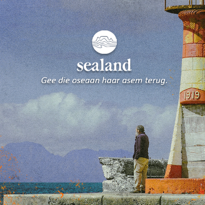
Kusdorp KleanUp
IIE-VegaSealand
Finalist
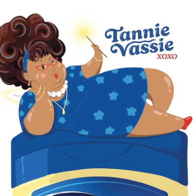
Sy fix mos alles
Red & Yellow Creative School of Business / Cape Town + Henriette Van Der Westhuizen / Cape Town + Aisha Dollie / Cape Town + Jacques Sampson / Cape TownVaseline
Finalist
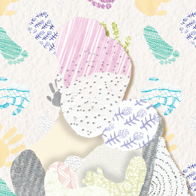
iQala Ngegama
Tyla Lottering / Cape Town + Litha Bathaka / Cape TownHome Affairs
Finalist
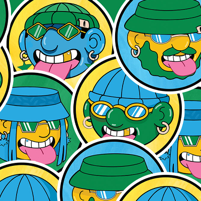
Taal Tongue Trek
Chesney Fouche / Johannesburg, + Caitlin Paige / Johannesburg, + Richardt Strydom / Johannesburg,Pendorings 25


