iPendoring 2025 Winners & Finalists
Umlingo Wezandla Eziningi
KiaraDos Reis / Johannesburg, + CaitlinPaige / Johannesburg, + CarlaSaunders / Johannesburg,
Client / Brand
Children's Book
Entry Title
Umlingo Wezandla Eziningi
Description (View/Hide)
Growing up, my mom always used to tell us that "many hands make light work." And that by working together, a challenging task can become manageable. This phrase is the foundation of this story. I found that an octopus was the perfect thing to convey the meaning of this proverbial phrase to children. Since even with their many, many arms, they are still just one creature, and only with teamwork can they accomplish the challenging goal that they set for themselves.
I used the aspect of magic in the story to convey how working together can lead to something incredible while introducing an imaginative and exciting narrative for the children. With a target audience of young children, I wanted a vibrant colour palette that could convey the character's emotions, while enhancing the coastal atmosphere. Saturated yellows, blues and turquoises were the main colours, with an accent of magenta and a few neutral tones to tie everything together and not overwhelm readers.
I used a bouncing, playful typeface for the body copy, Ruddy, to convey they characters youthful excitement, and further appeal to the target audience.
Entered In
KiaraDos Reis / Johannesburg, + CaitlinPaige / Johannesburg, + CarlaSaunders / Johannesburg,
Client / Brand
Children's Book
Entry Title
Umlingo Wezandla Eziningi
Description (View/Hide)
Growing up, my mom always used to tell us that "many hands make light work." And that by working together, a challenging task can become manageable. This phrase is the foundation of this story. I found that an octopus was the perfect thing to convey the meaning of this proverbial phrase to children. Since even with their many, many arms, they are still just one creature, and only with teamwork can they accomplish the challenging goal that they set for themselves.
I used the aspect of magic in the story to convey how working together can lead to something incredible while introducing an imaginative and exciting narrative for the children. With a target audience of young children, I wanted a vibrant colour palette that could convey the character's emotions, while enhancing the coastal atmosphere. Saturated yellows, blues and turquoises were the main colours, with an accent of magenta and a few neutral tones to tie everything together and not overwhelm readers.
I used a bouncing, playful typeface for the body copy, Ruddy, to convey they characters youthful excitement, and further appeal to the target audience.
I used the aspect of magic in the story to convey how working together can lead to something incredible while introducing an imaginative and exciting narrative for the children. With a target audience of young children, I wanted a vibrant colour palette that could convey the character's emotions, while enhancing the coastal atmosphere. Saturated yellows, blues and turquoises were the main colours, with an accent of magenta and a few neutral tones to tie everything together and not overwhelm readers.
I used a bouncing, playful typeface for the body copy, Ruddy, to convey they characters youthful excitement, and further appeal to the target audience.
View More Entries
Finalist
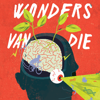
Die Wonders van die Heelal
Karlien De Villiers / Stellenbosch + Ané Cloete / StellenboschWonders of the Universe
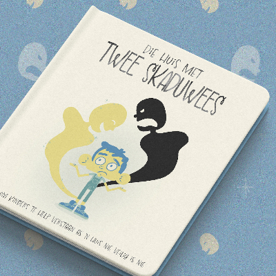
Finalist
Small Voices
Mehna Gokal / Johannesburg, + Nkosi Msomi / JohanessburgEnd Violence Against Children

Overall Student Winner
From Corner Shop to Kitchen
University of Johannesburg / Johannesburg + Courtney Hodgson + Deirdre Pretorius + Roela HattinghDesign Bites
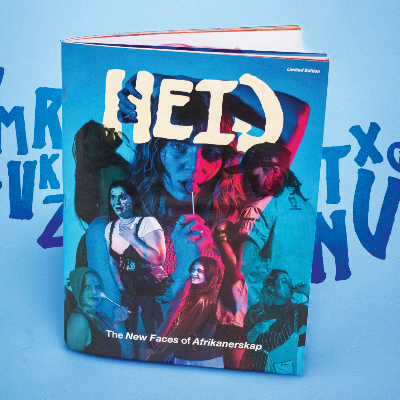
Finalist
Heid: Vroulikheid & Ordentelikheid
Klara Appelgrein / Stellenbosch + Suen Muller / StellenboschHeid