iPendoring 2025 Winners & Finalists
Kom ons doenit hair salon brand identity
Mari Moodie Design Studio (Pty) Ltd / Bellville
Client / Brand
Kom ons doenit
Entry Title
Kom ons doenit hair salon brand identity
Description (View/Hide)
KOM ONS DOENIT LOGO DESIGN: THE NAME WITH A SNIP OF CLEVERNESS & HAIR LAYERED MEANING!
“Ek moet my hare laat doen.”
“My hare is ge-do.”
Ever sat in a salon chair, shared your vision, and heard the stylist say, “Kom ons doenit”? That phrase — energetic, familiar, and full of intent — sparked the name Kom ons doenit.
Rooted in everyday salon language, doenit (doen dit) reflects how Afrikaans speakers might say: “Ek moet my hare laat doen” or “My hare is ge-do.” It’s casual, catchy, and full of (hair) layered meaning.
Visually, the brand is just as thoughtful:
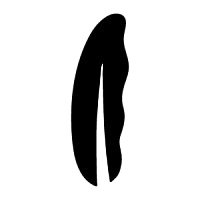
The letters d and o were crafted to mimic the finger rings of a hairdresser’s scissor, while the d’s serif subtly suggests the silencer of the tool. The scissor’s blade seamlessly extends from the d, cleverly forming a closed scissor shape. The letter n was cleverly positioned below the letter o, to convey the impression of the finger rest. The primary logo reads Kom ons doenit, but what's truly remarkable is that the icon still clearly conveys do.
The italic typeface adds a sense of motion — a nod to doenit’s spirit of action and forward momentum. Even the word it adds a playful twist, opening up opportunities for dynamic, clever branding language.
The logo’s black and white colour palette balances a clean, professional feel with the youthful, trendy, and vibrant energy that defines the brand.
Entered In
Mari Moodie Design Studio (Pty) Ltd / Bellville
Client / Brand
Kom ons doenit
Entry Title
Kom ons doenit hair salon brand identity
Description (View/Hide)
KOM ONS DOENIT LOGO DESIGN: THE NAME WITH A SNIP OF CLEVERNESS & HAIR LAYERED MEANING!
“Ek moet my hare laat doen.”
“My hare is ge-do.”
Ever sat in a salon chair, shared your vision, and heard the stylist say, “Kom ons doenit”? That phrase — energetic, familiar, and full of intent — sparked the name Kom ons doenit.
Rooted in everyday salon language, doenit (doen dit) reflects how Afrikaans speakers might say: “Ek moet my hare laat doen” or “My hare is ge-do.” It’s casual, catchy, and full of (hair) layered meaning.
Visually, the brand is just as thoughtful:
The letters d and o were crafted to mimic the finger rings of a hairdresser’s scissor, while the d’s serif subtly suggests the silencer of the tool. The scissor’s blade seamlessly extends from the d, cleverly forming a closed scissor shape. The letter n was cleverly positioned below the letter o, to convey the impression of the finger rest. The primary logo reads Kom ons doenit, but what's truly remarkable is that the icon still clearly conveys do.
The italic typeface adds a sense of motion — a nod to doenit’s spirit of action and forward momentum. Even the word it adds a playful twist, opening up opportunities for dynamic, clever branding language.
The logo’s black and white colour palette balances a clean, professional feel with the youthful, trendy, and vibrant energy that defines the brand.
“Ek moet my hare laat doen.”
“My hare is ge-do.”
Ever sat in a salon chair, shared your vision, and heard the stylist say, “Kom ons doenit”? That phrase — energetic, familiar, and full of intent — sparked the name Kom ons doenit.
Rooted in everyday salon language, doenit (doen dit) reflects how Afrikaans speakers might say: “Ek moet my hare laat doen” or “My hare is ge-do.” It’s casual, catchy, and full of (hair) layered meaning.
Visually, the brand is just as thoughtful:
The letters d and o were crafted to mimic the finger rings of a hairdresser’s scissor, while the d’s serif subtly suggests the silencer of the tool. The scissor’s blade seamlessly extends from the d, cleverly forming a closed scissor shape. The letter n was cleverly positioned below the letter o, to convey the impression of the finger rest. The primary logo reads Kom ons doenit, but what's truly remarkable is that the icon still clearly conveys do.
The italic typeface adds a sense of motion — a nod to doenit’s spirit of action and forward momentum. Even the word it adds a playful twist, opening up opportunities for dynamic, clever branding language.
The logo’s black and white colour palette balances a clean, professional feel with the youthful, trendy, and vibrant energy that defines the brand.
View More Entries

Silver Pendoring
OMTOORVUUR / TRANSFORMATIVE FIRE
Sentient Creative / JohannesburgkykNET Silwerskermfees 2025